New Zealand Research Information System (NZRIS)
The Ministry of Business, Innovation and Employment (MBIE) invests around $1.8 billion annually into New Zealand’s research, science and innovation system. However, understanding where that funding goes and what it supports has historically been difficult—even answering simple questions like “how much is invested in a particular area?” was challenging.
In partnership with software company Deviate, I helped redesign a publicly accessible platform to unpack complex data and make it more accessible, interactive and engaging for all users, regardless of technical expertise.
Role: UI Designer
Tools: Figma, Excel and Miro
Year: 2021
Deliverable: Figma UI designs for mobile,tablet and desktop
Type: Agency project
Brief
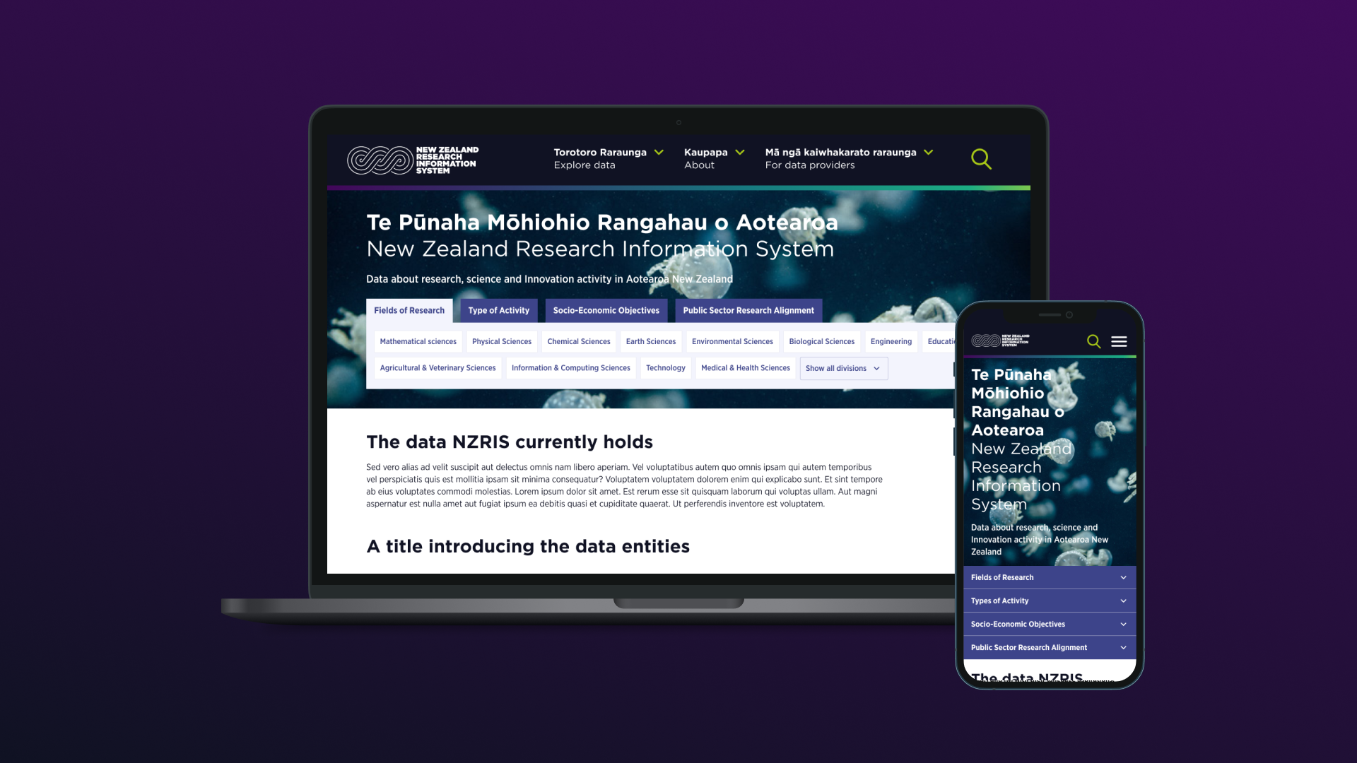
MBIE wanted a modular platform redesign to manage their vast and growing data. The goal was to create a flexible and scalable system that adapts to new data, improves usability, and delivers consistent, high-performance access to complex information.
Process
Because of the tight turn around we utilised pre-existing assets and designs to support the development of the new platform.
The previous design agency delivered great personas and user journeys to help me better understand the target audiences and their needs and aspirations for the platform which was in summary to track public investments in research and identify trends and gaps in research areas.
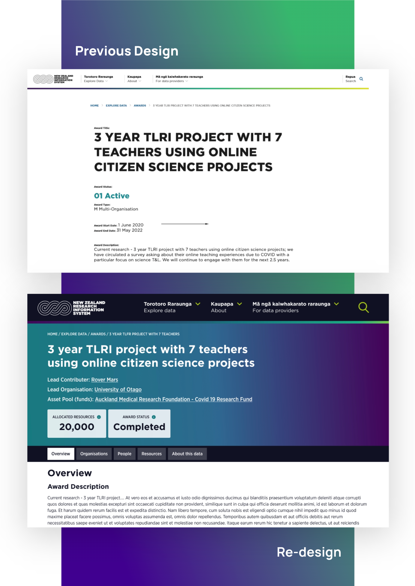
I unpacked the existing Adobe XD prototype with the project team to understand their thoughts and feelings with the current prototype and ideated appropriate ways to improve the current design and consider data input.
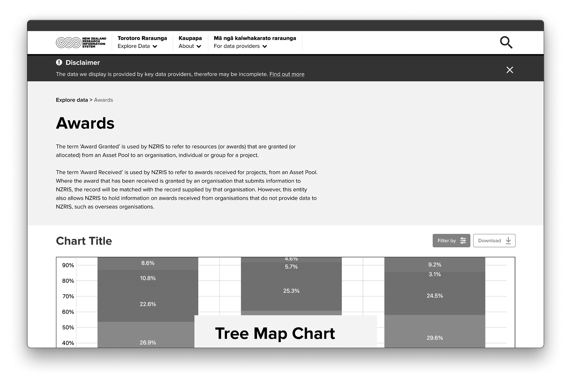
Findings: Their issues were more focused on the velocity of data and ensuring the charts used throughout the tool were consistent with the brand and appropriate for the data. In terms of the page layout they didn’t enjoy the large amounts of vertical scrolling.
Site Structure
I started by unpacking the information architecture and identifying key pages to redesign and wireframe to suit the new approach. Below is a breakdown of the figma file I created to communicate the readiness of each page and add context to certain features throughout the development.
I tested this repeatedly with the team helping them to utilise figma prototype and explore the tool in their own time before bringing in their feedback.

Key Challenges
After better understanding the problem space and priorities - we identified these key challenges our client wanted to see in the new tool.
• Present large volumes of complex data in a way that is visually clear, intuitive, and interactive.
• Help users—from the public to policymakers—understand funding distribution, identify gaps, and draw meaningful insights from the data.
• Design an interface that is accessible, bilingual, and aligned with Te Ao Māori values.
UI Design Development
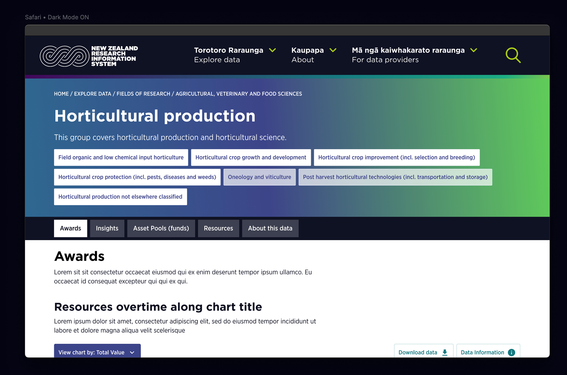
The project team emphasised the need to improve the hirearchy of information creating better ways display complex data in a clear and simple way as well as reduce vertical scrolling.
I elevated their existing designs by creating a flexible top banner that highlights the most important information and introduced a horizontal bar to reduce vertical scrolling and group content accordingly. I also improved the visual hierarchy by using bold headers, colour blocking and gradients.

UI Design Development
NZRIS had well-established brand guidelines that provided a solid foundation for the visual direction of the tool. I built upon these existing guidelines, elevating the design to maintain consistency with the current branding approach and ensuring full alignment with WCAG 2.0 accessibility standards.
To further support this, I developed a comprehensive pattern library that accurately defined how the brand was applied across the website, covering elements such as colour, typography, spacing, and UI components. This pattern library not only ensured consistency in design but also served as a reference for future iterations and scalability of the platform.

Data Visualisation Design
I collaborated with data experts to select chart types and visual interactions for every dataset. We used AM Charts to prototype with real data and test responsiveness across breakpoints. I then created a scalable visual language for charts and infographics.
Reflections
This project was a valuable opportunity to apply UI design within a complex data environment while upholding accessibility and cultural relevance. Collaborating across disciplines—from data analysts to developers—reinforced the importance of clear communication and adaptable design systems.
I enjoyed creating a robust pattern library and intuitive interface helped bring clarity to a data-heavy experience, while contributing to a more transparent and informed research sector. I’m proud to have played a part in shaping a platform that empowers users to engage meaningfully with New Zealand’s investment in research, science and innovation.
Since our involvement, NZRIS has shifted platforms to resolve backend data issues. While the technical solution has changed, our work laid a strong design foundation—ensuring the platform remains modular, user-friendly, and accessible as it continues to evolve.
Collaborators
John Moore
Deviate (Web Development)
Client
Ministry of Business and Innovation (MBIE)
Agency
Indigenous Design and Innovation Aotearoa (IDIA)