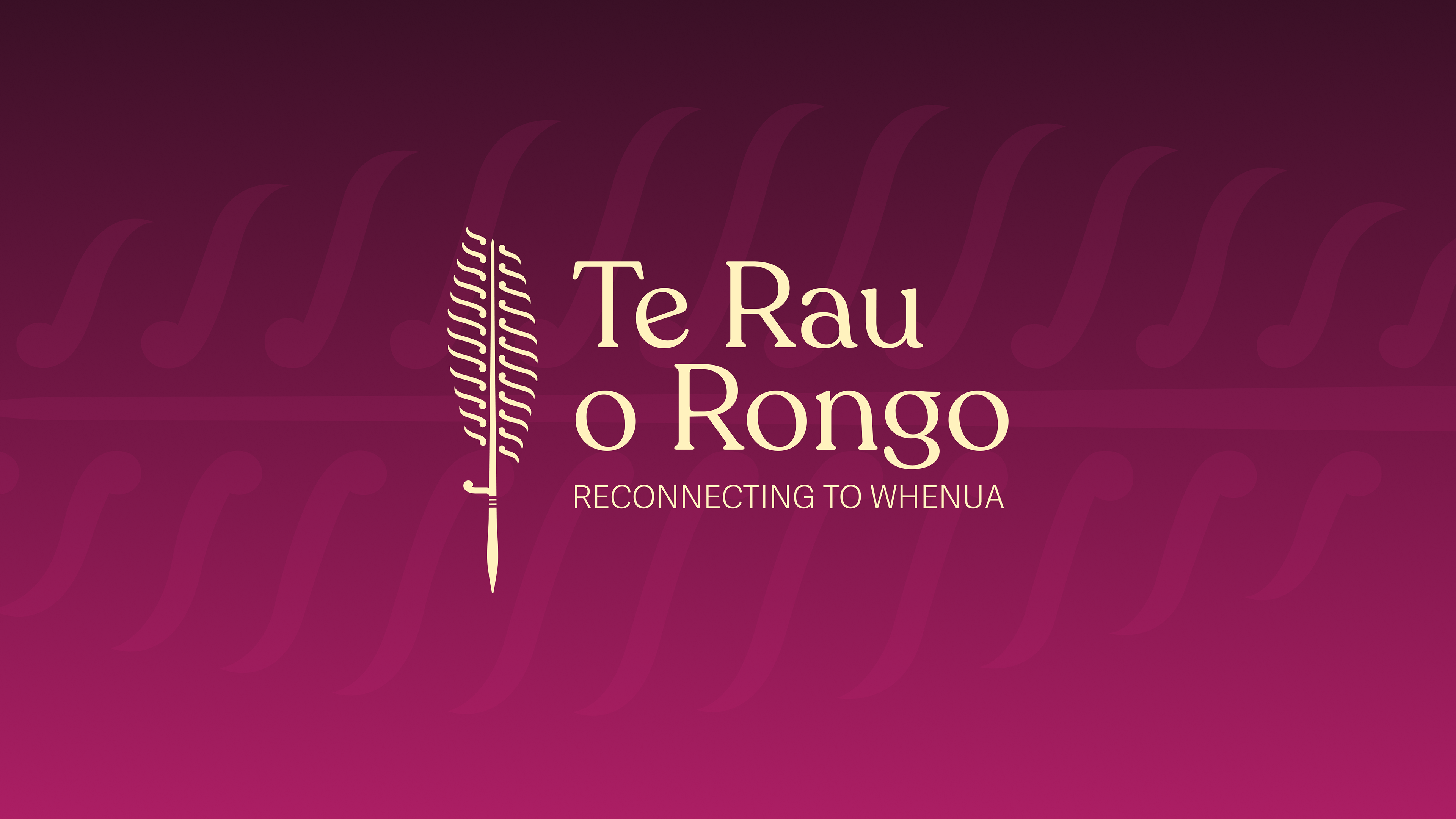
Te Rau o Rongo
Te Rau o Rongo Charitable Trust based in Waitara, Taranaki is a wāhine led maara (garden) dedicated to supporting whānau to reconnect to whenua (land) through gardening. Their goal is to promote food sovereignty and indigenous sustainable living practices, because healing the whenua will lead to the healing of our people.
Role: Graphic Designer
Tools: Adobe Illustrator, Miro, Google Documents
Timeline: 3 months
Deliverable: Brand Identity and Website
Type: Freelance
The Challenge
The team at Te Rau o Rongo were seeking a tōhu (logo) that visually embodies the essence of Te Rau o Rongo, which means 'the many ways to find peace.' They wanted to visually communicate that people can find peace through cultivation.
Through brainstorming workshops with the team, I identified four key goals for their kaupapa: fostering peace and harmony through gardening, empowering individuals with mana motuhake (self-determination), reconnecting whānau with their whenua, and honouring the atua, Rongo-mā-Tāne and Papatūānuku.
These key goals played a crucial role in guiding the ideation process, helping to identify symbols, imagery, and concepts for exploration during development. As someone from Taranaki, I was also able to draw on my knowledge of the whenua to inform and enrich the design.
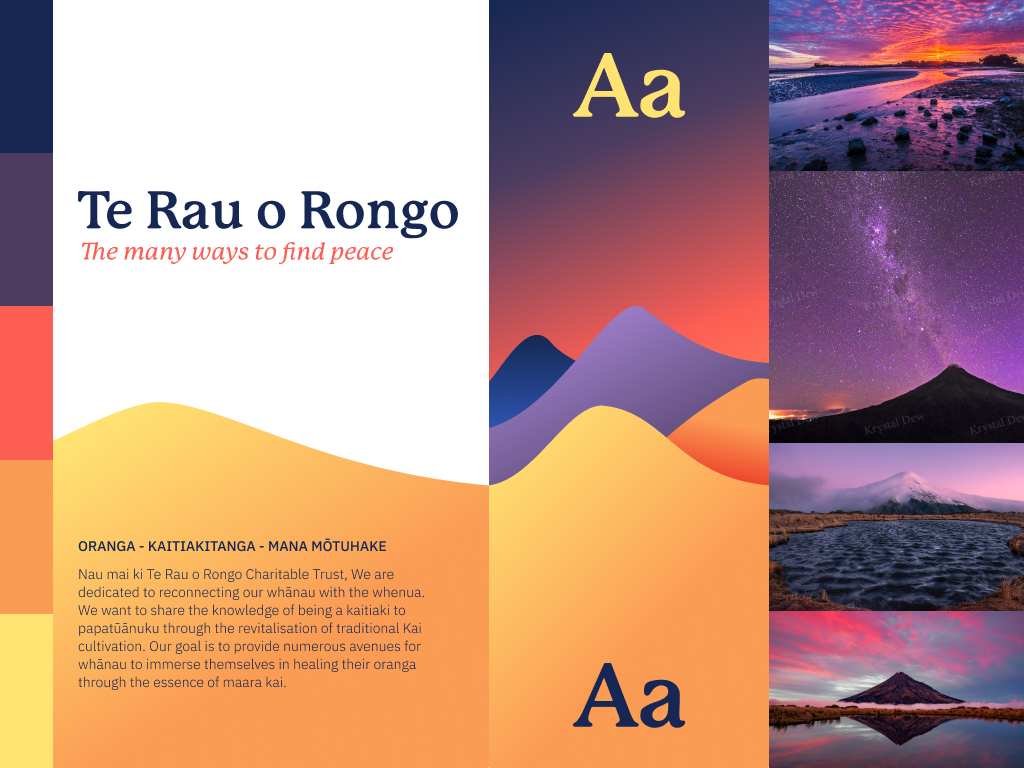
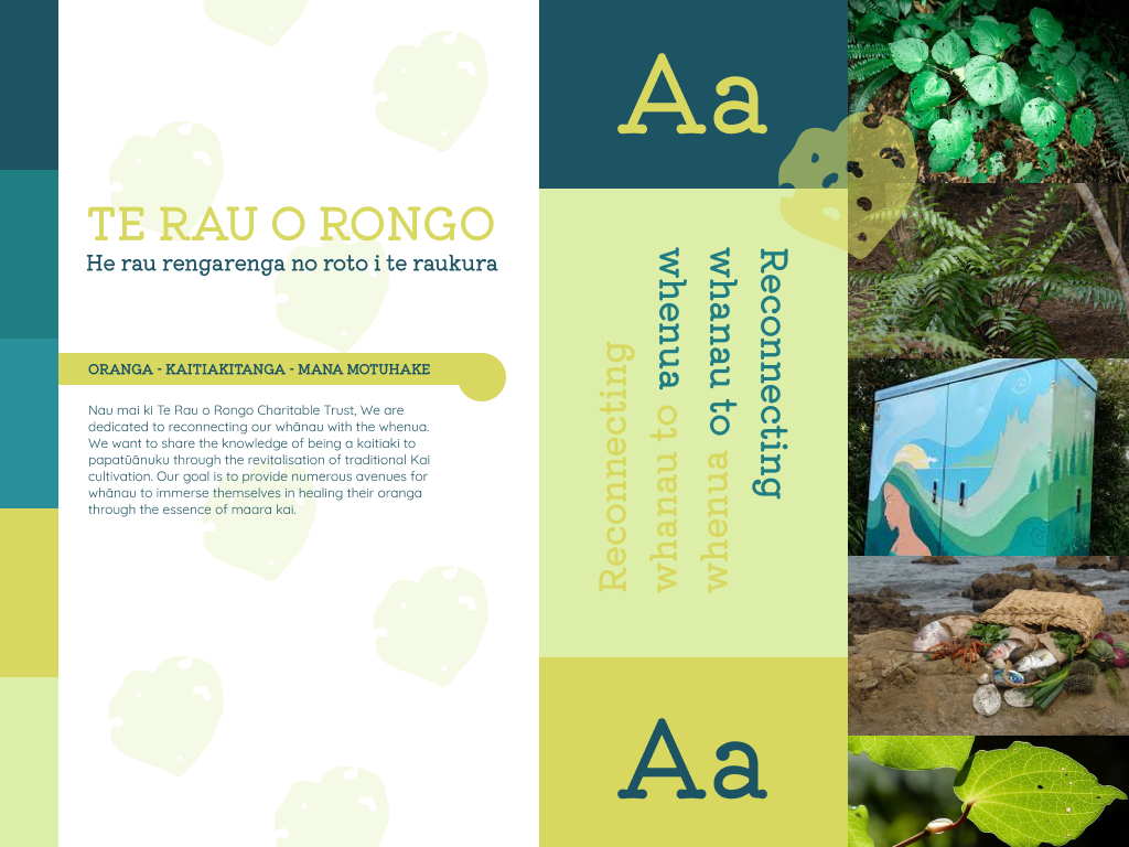
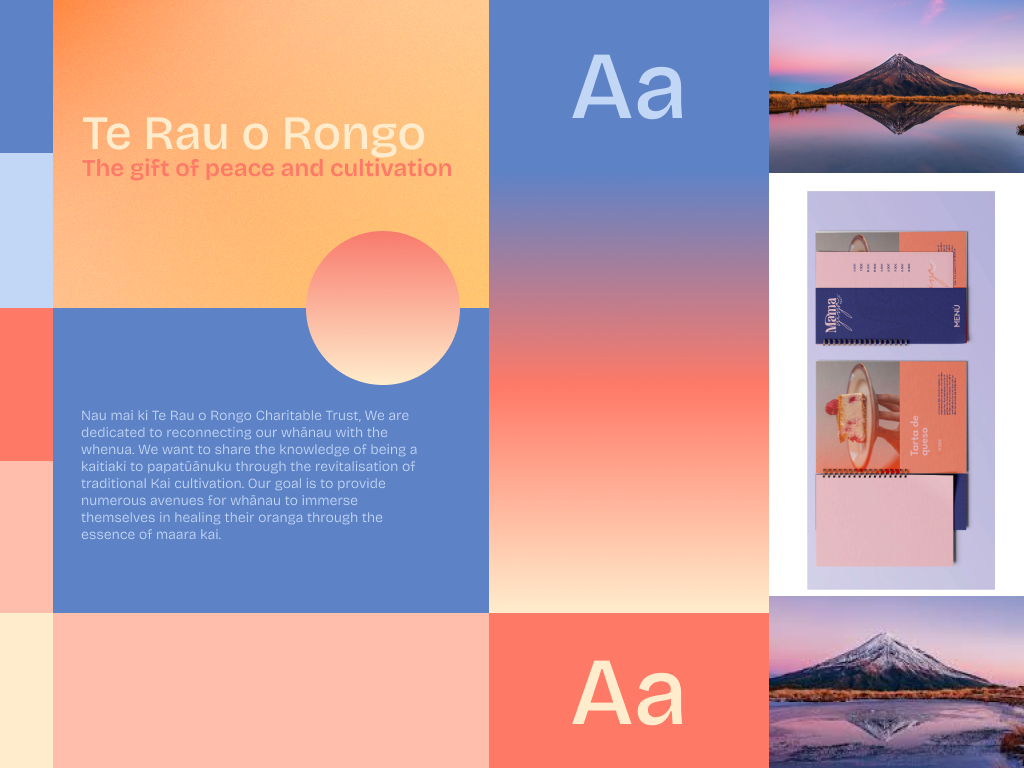

Stylescapes
During the ideation phase I created stylescapes to gain a clearer understanding of the design style my client envisioned. These were curated based on our conversations and the ideas that emerged, helping to refine and define the direction for ideation. The last stylescape was the chosen visual direction.
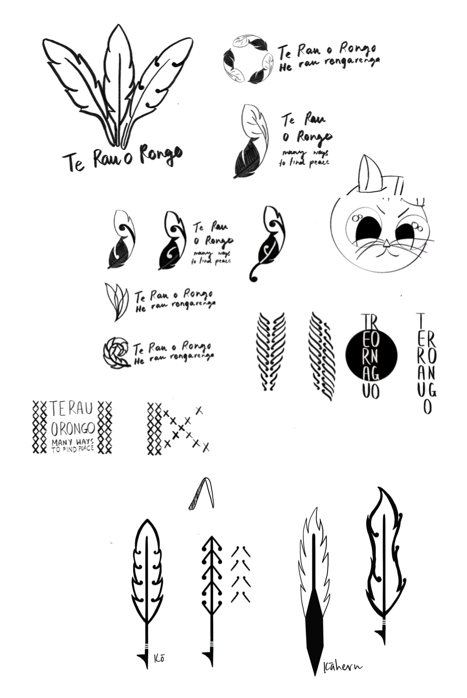
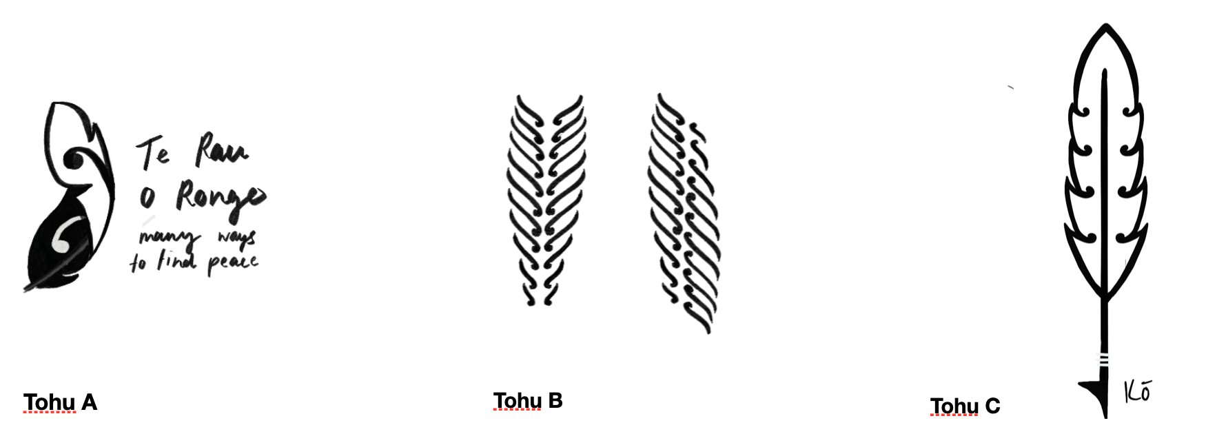
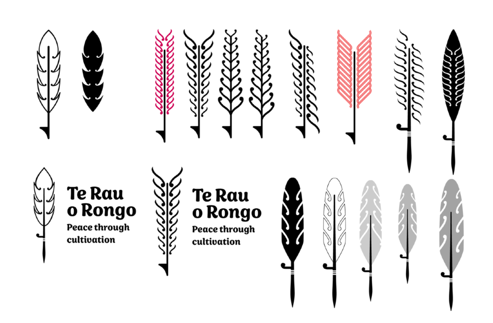

Ideation
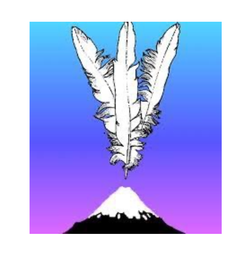
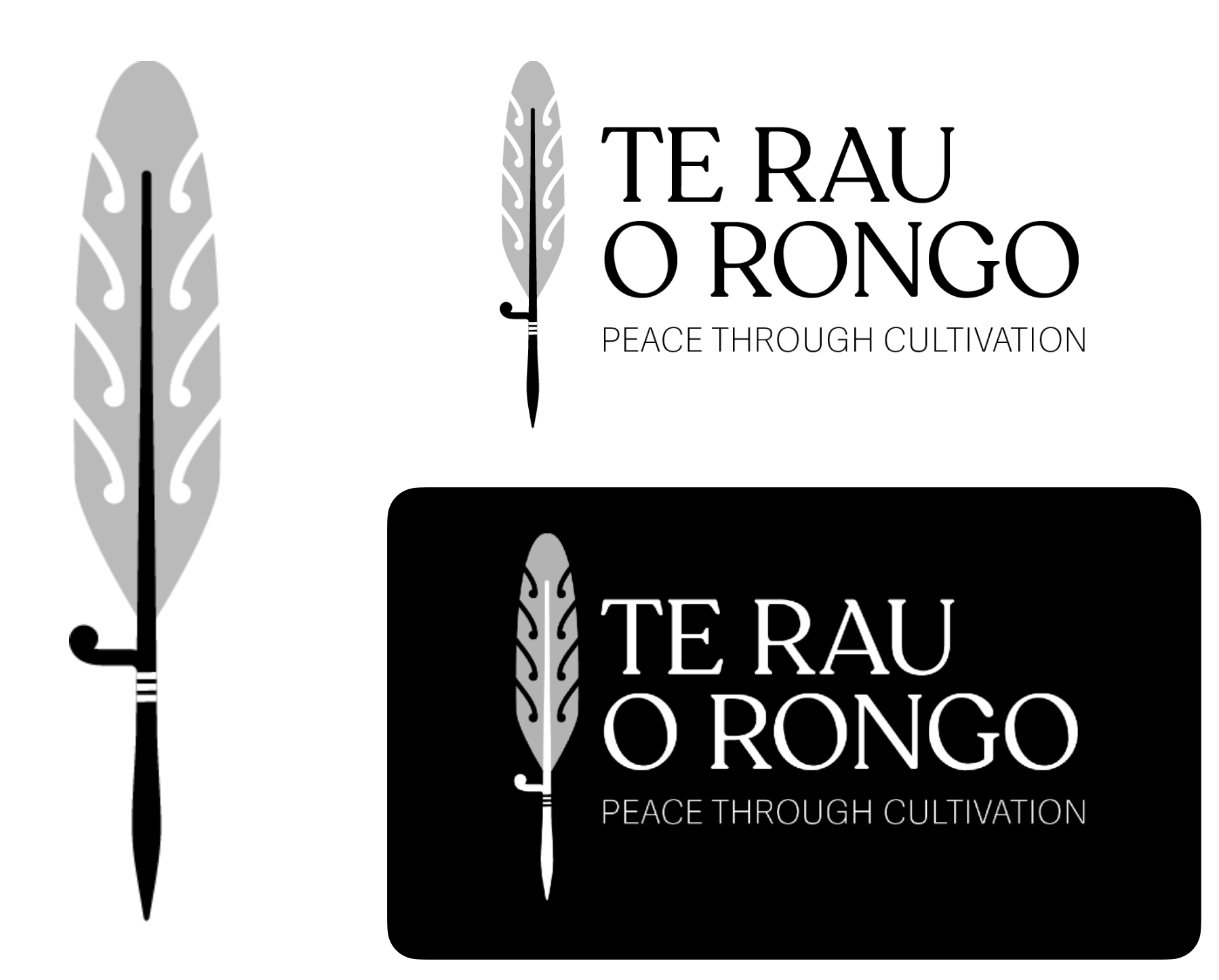
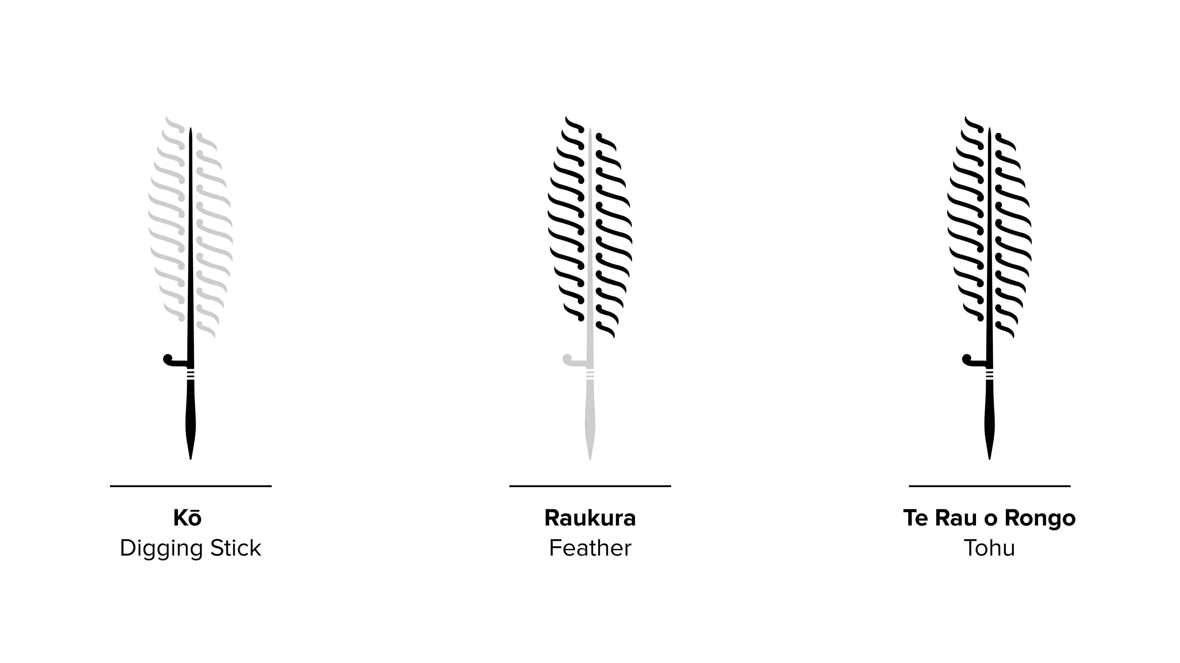
The final concept went through many iterations before it felt just right. I was particularly inspired by one of the tagline ideas, ‘peace through cultivation,’ which immediately brought to mind Te Raukura (the feather), a highly significant symbol in Taranaki.
Te Raukura represents peace and, more specifically, acknowledges Parihaka—a Māori community founded on principles of peace and unity. It embodies spiritual, physical, and communal harmony.
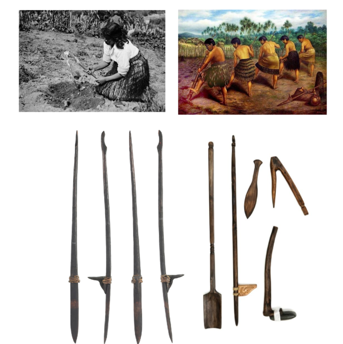
To complement this, I incorporated the kō a traditional Māori gardening tool used to prepare garden beds for planting. Its long, sleek form grounds the tōhu, creating space for the feathers to emerge from the kō—symbolising communities coming together to reconnect with the whenua.
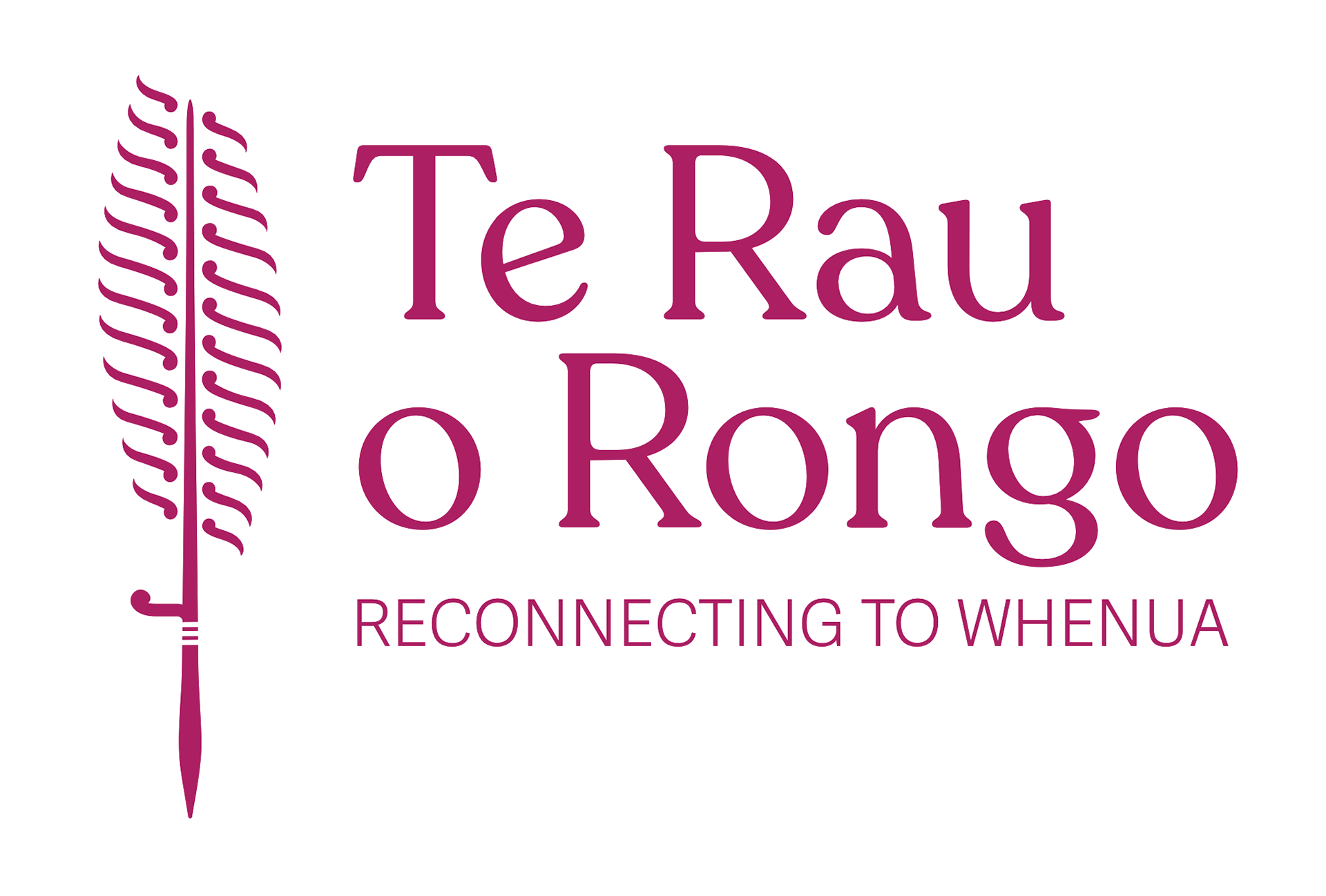
Colour Palette
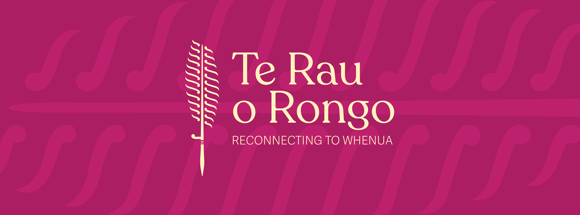
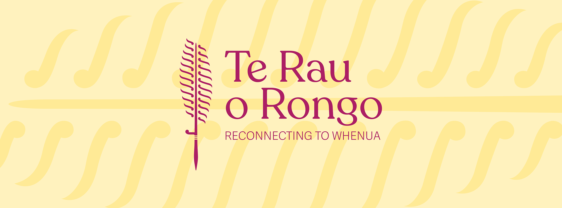
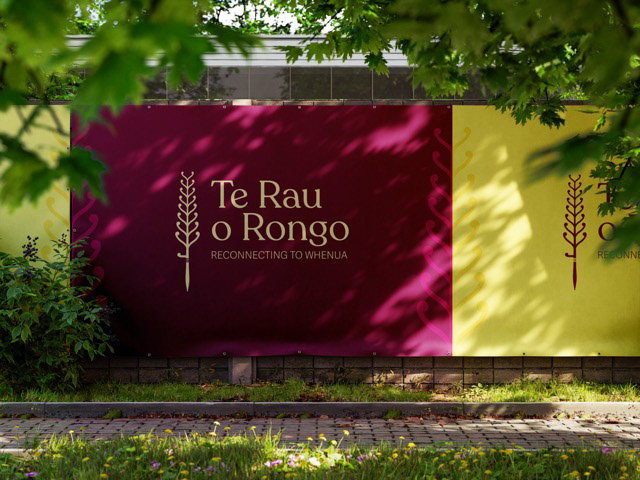
The colour palette is inspired by the kūmara - a traditional māori sweet potato. The skin is various hues of red and purple while the flesh is a creamy yellow. These colours influenced me to create two variations of the final logo - burgundy kūmara and kōwhai yellow.
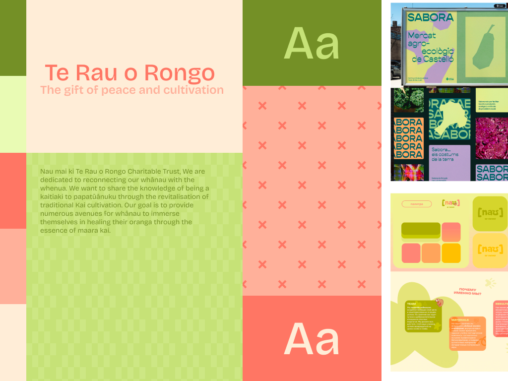
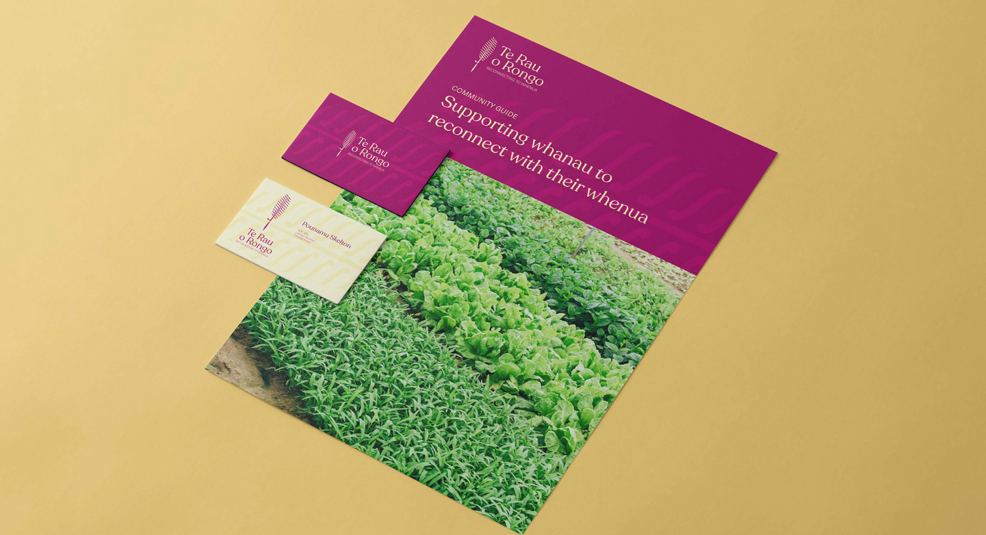
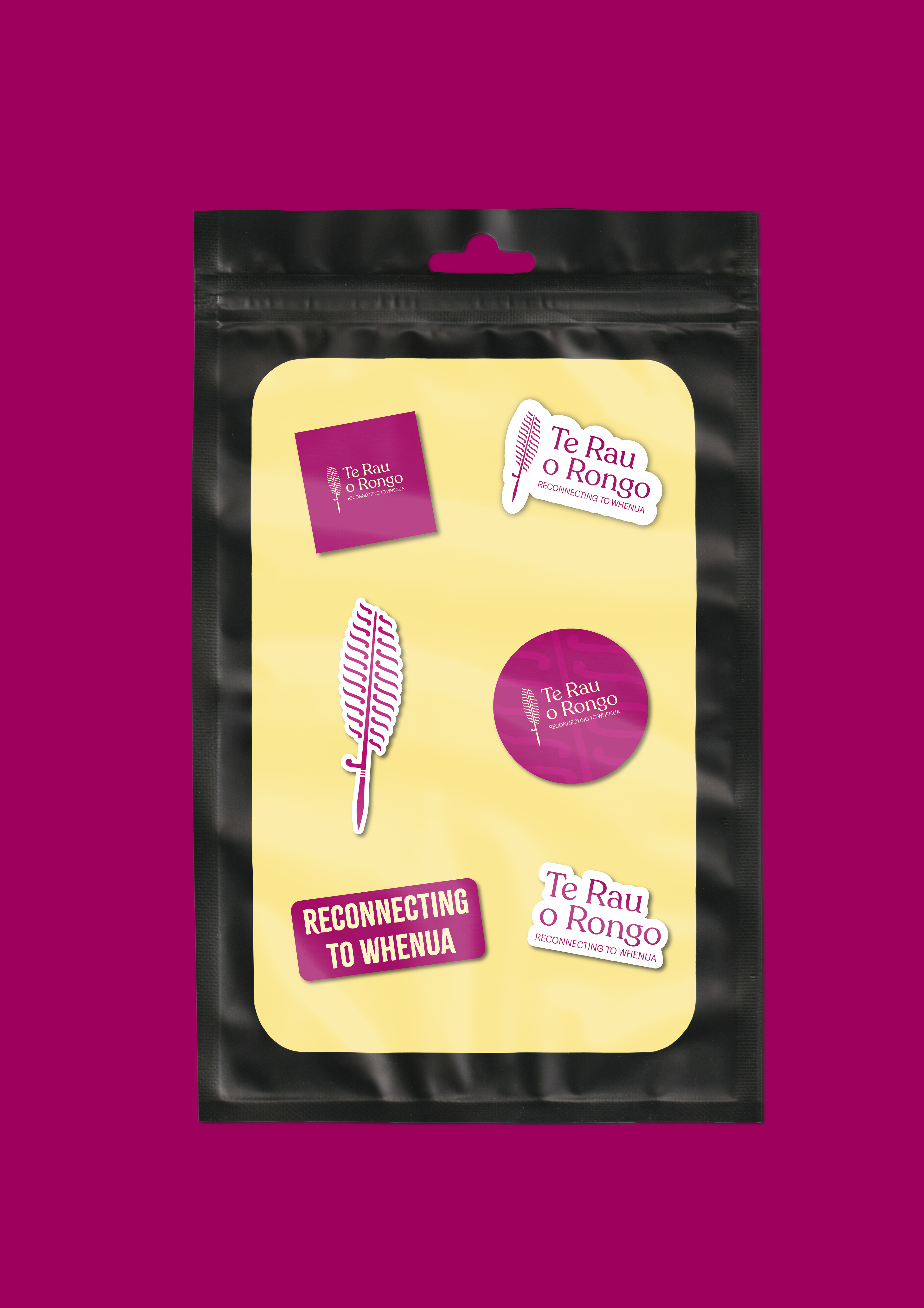
Design Assets
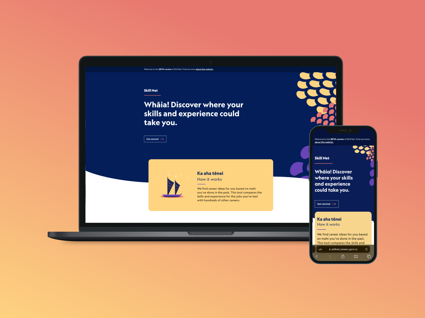
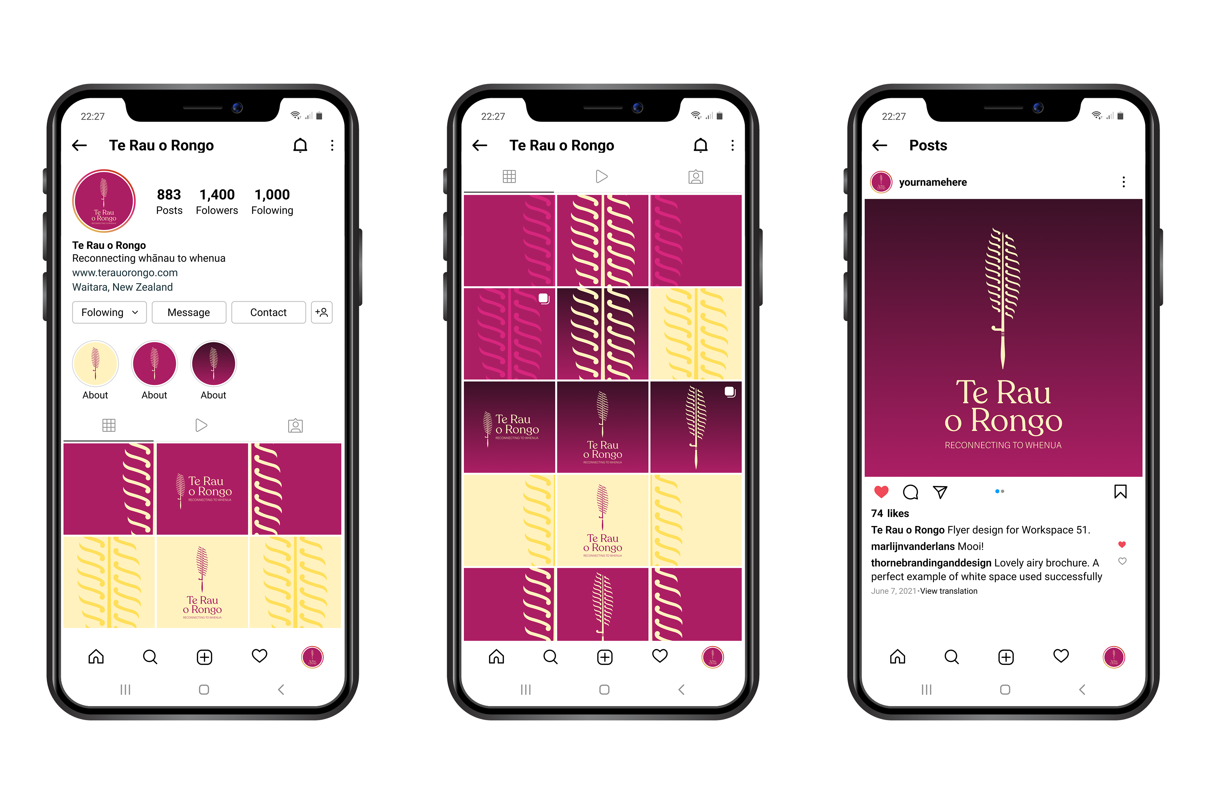
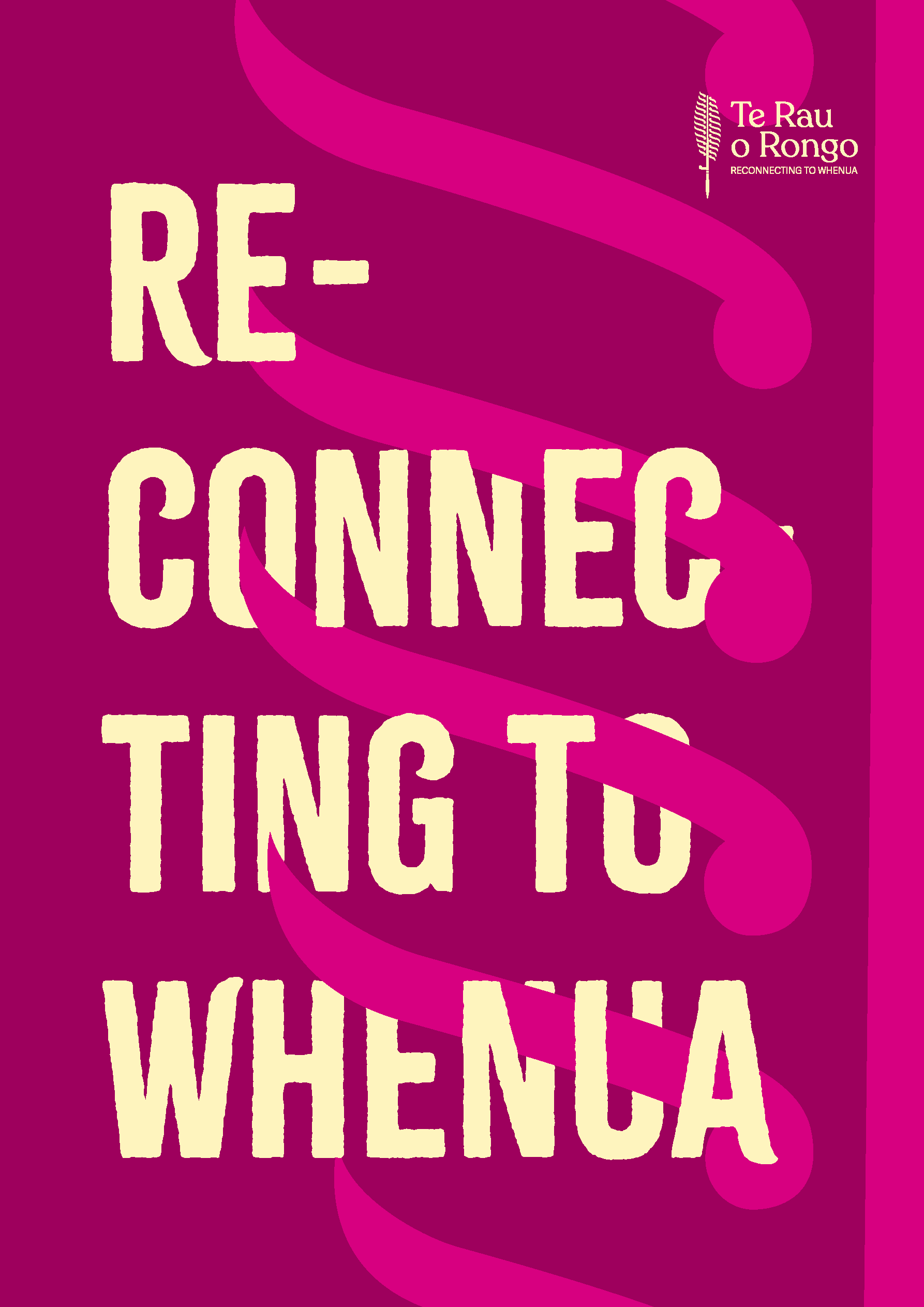
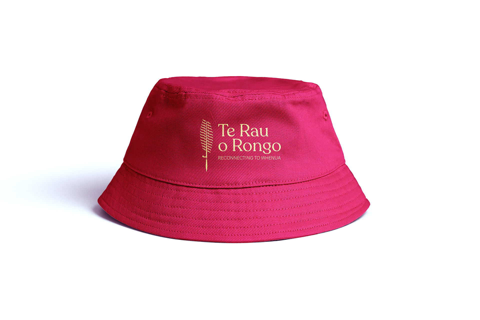
Alongside the visual identity, I also designed a suite of supporting assets, including social media graphics, merchandise, and a website. These elements were carefully crafted to ensure a cohesive and impactful brand presence, allowing Te Rau o Rongo to share their kaupapa with the world in an engaging and accessible way.

Website was made on Mastermind.
Client
Te Rau o Rongo Charitable Trust